Branding
About This Project
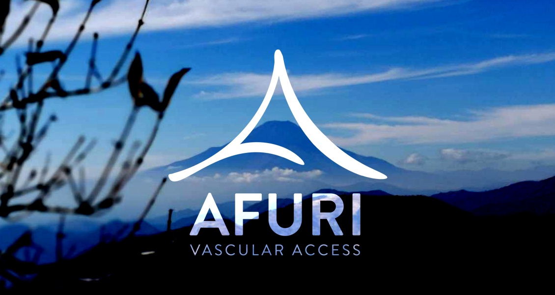
Afuri Vascular Access
Aufri Vascular Access emerged from the vision to revolutionize hemodialysis access, providing a crucial pathway to blood for the hemodialysis process. This access facilitates the passage of blood through specialized tubes to a dialysis machine equipped with a filtering mechanism known as a dialyzer, cleansing the blood in the process. Establishing this access involves a minor surgical procedure vital for patients undergoing hemodialysis.
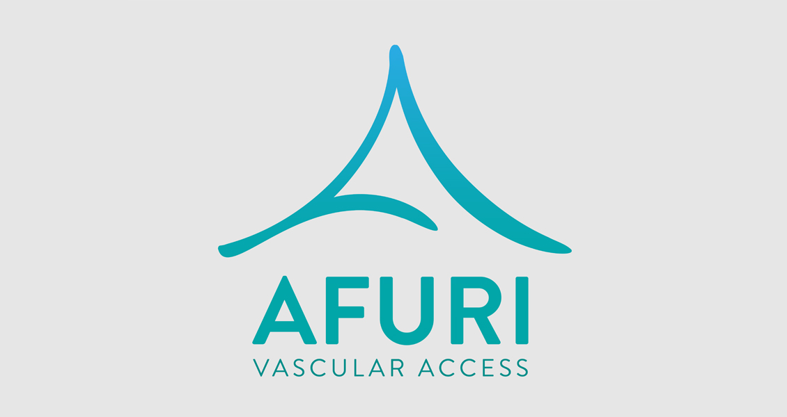
The inception of the company traces back to the founder's transformative journey to Japan, where inspiration struck amidst the healing culture surrounding the Afuri mountain. Local lore revered a river flowing from the mountain as a therapeutic vein, drawing pilgrims seeking healing. Entrusted with capturing this essence, I was tasked with channeling this inspiration into the company's branding.
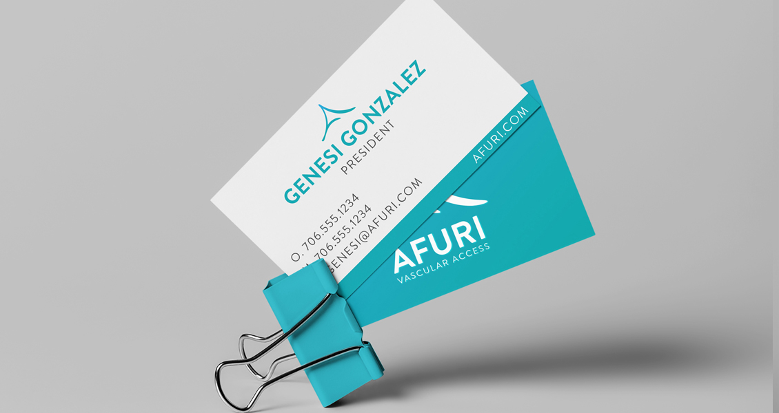
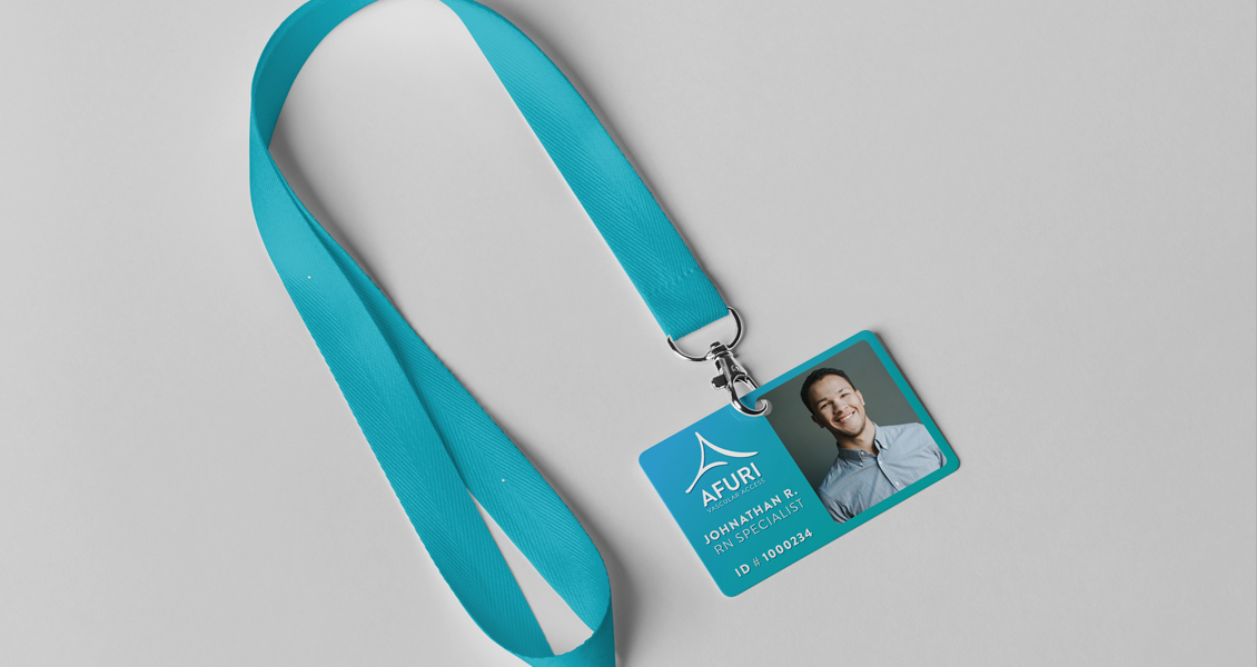
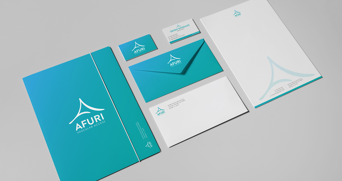
My role extended beyond mere branding; it encompassed meticulous UX research, delving into the competitive landscape to discern optimal branding elements resonating with the target audience. Through comprehensive research and analysis, I unveiled compelling branding colors tailored to resonate deeply with users.
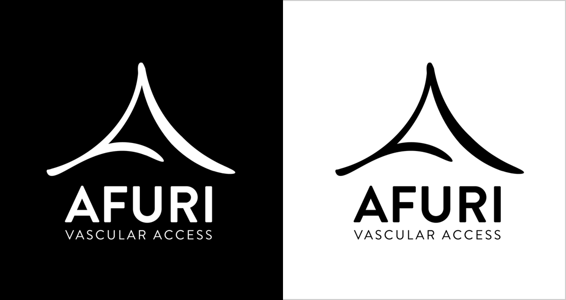
The culmination of this endeavor resulted in a symbolic logo representing the Afuri mountain and the serpentine river symbolizing healing, akin to veins coursing through the human body. This visual identity embodied the essence of healing and connectivity, encapsulating the company's mission to offer a pathway to improved health and well-being.